



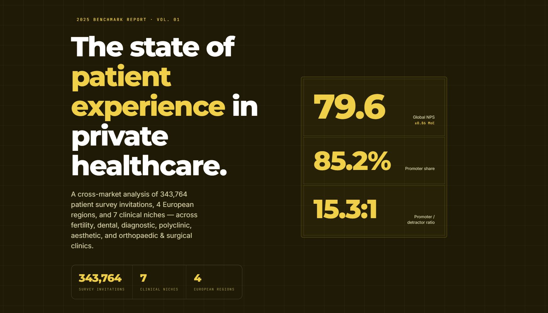
This is the story of how we analysed 343,764 patient surveys across four European regions and seven clinical niches, and benchmarked the results against published industry data.
One finding frames all the others: private healthcare clinics running structured patient-feedback programmes score 20–27 NPS points above published industry averages.
This report breaks down why — and what separates the clinics doing it well from the ones quietly leaving value on the table.
Why we ran this research
After years of processing hundreds of thousands of patient responses, we noticed something. Every clinic wanted the same thing, and none of them had it — context for proper benchmarking.
A dental group with an NPS of 82 has no idea whether that's brilliant or mediocre until it can see what other dental groups are doing. So we built the benchmark to answer exactly that.
"Hundreds of thousands of patients have come our way, and every response we processed made our surveys, messages, and systems a little sharper. We built these benchmarks so that every clinic — whatever its speciality — can see exactly how it performs against its peers. All of it validated on a large random sample, without ever exposing a single patient's data." — Nikola Komes, the founder and CEO of InsiderCX
What did we find out?
Five findings stood out. On their own they're interesting; read together they tell one story — that a patient-experience score is never just a score, and that the clinics pulling ahead are the ones who understand what sits underneath it.
Finding 1: Private clinics are beating the world
The global NPS across our dataset was 79.6. To put that in perspective: published 2025 benchmarks put the average healthcare NPS somewhere between +53 and +58, and the widely cited "world-class" threshold is +70.
It holds up across the board, too. Fertility clinics top the leaderboard, and even the lowest-scoring niche — orthopaedic and surgical care, where longer stays and tougher recoveries structurally depress scores — still comes in above the industry average.
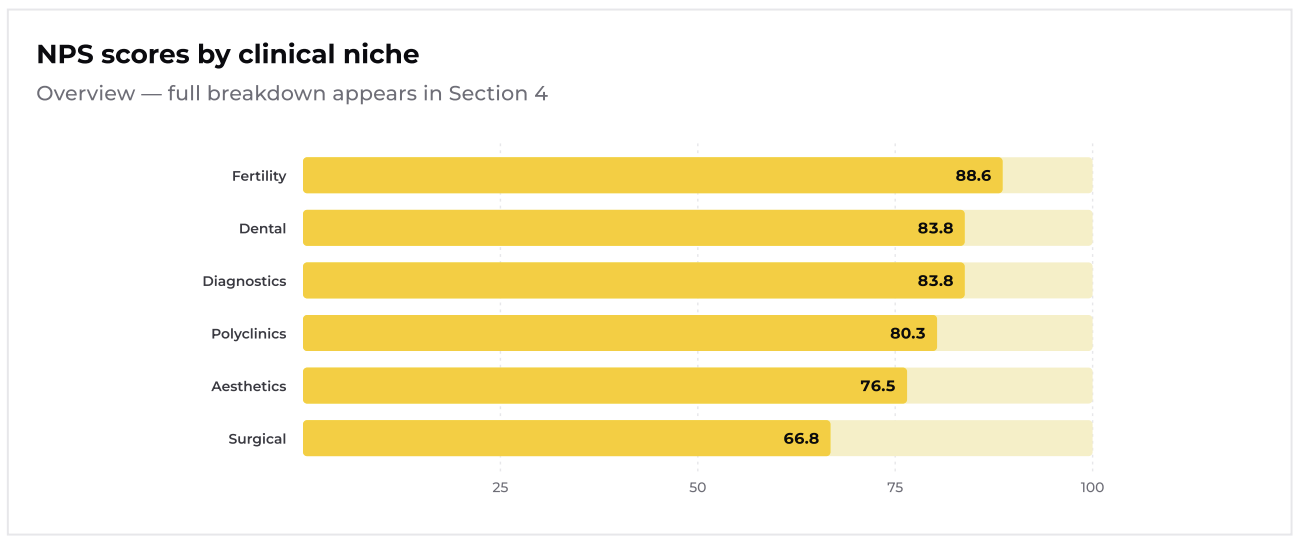
The full report contains a more detailed niche-by-niche and region-by-region breakdown.
That's the good news. It also raises an uncomfortable question: if scores this high are the norm, where does the risk hide? The answer turns out to be inside the score itself.
Finding 2: Your "satisfied" patients are the ones quietly leaving
This is the finding that we care about the most.
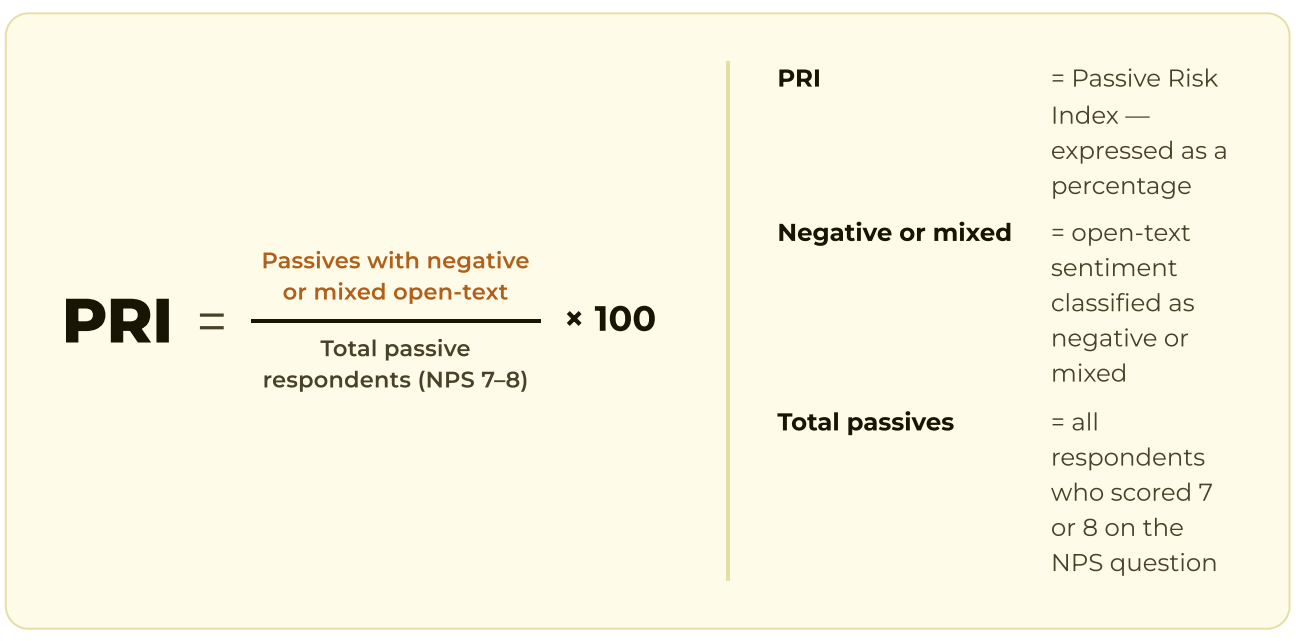
Everyone watches their detractors — the 0–6 scorers who complain loudly. Almost nobody watches their passives, the 7–8 scorers the NPS formula ignores entirely on the assumption that they're "satisfied enough."
They're not. When we read what passives actually wrote in their comments, 37.8% left negative or mixed feedback — more than five times the rate of promoters. Dig deeper, and fewer than one in eight passives turn out to be genuinely happy. They won't complain, they won't leave a bad review, and they won't trigger any alert. They just don't come back.
We built a metric to track this blind spot — we call it the Passive Risk Index — and it's one of the more actionable findings in the full report.
Finding 3: Younger patients aren't harder to please
When a chunk of patients quietly sours, the instinct is to blame the crowd — younger patients are tougher, this generation expects too much, and so on. The data kills that excuse. From Gen Z to Boomers, there are only about three NPS points of difference. That's noise, not signal.
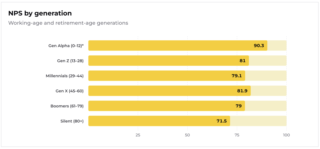
There is one genuine quirk, though — an engagement paradox. Older patients respond to surveys far more often than younger ones, but they also score slightly more critically. So a clinic with an older patient base should expect its headline number to sit a touch lower, purely because of who takes the time to reply. It's context to know, not a problem to fix.
TL;DR: If demographics barely move the score, then the score is mostly a reflection of the programme — the part you actually control. Which is exactly where the opportunity opens up.
Finding 4: Small changes, big lifts
The most encouraging part of the report is seeing how small changes in your quality and feedback processes can result in big wins.
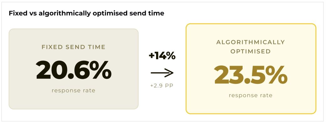
Simply moving from a fixed survey send time to an algorithmically optimised one lifted survey response rates by 14% — at zero cost and with no change to the message. Turning on automated reminders added another +5.9 percentage points.
And the wording of the invitation turned out to matter more than anyone expected, shifting not just how many patients responded but the scores they gave when they did.
These two small changes bring in more responses and surface more of the quiet dissatisfaction from Finding 2 — while there's still time to act on it. There's a clear priority order and the exact winning message copy in the full report.
The short version: how you ask and when you send the survey can meaningfully change what you hear.
Finding 5: Feedback is a reputation engine
Get all of that right, and the effect doesn't stay inside the clinic. Across clinics with matched surveys and Google data, the ones collecting the most feedback also accumulated the most public reviews — by a wide margin.
Clinics with more than 3,000 survey responses averaged over eight times as many new Google reviews as those with fewer than 500.
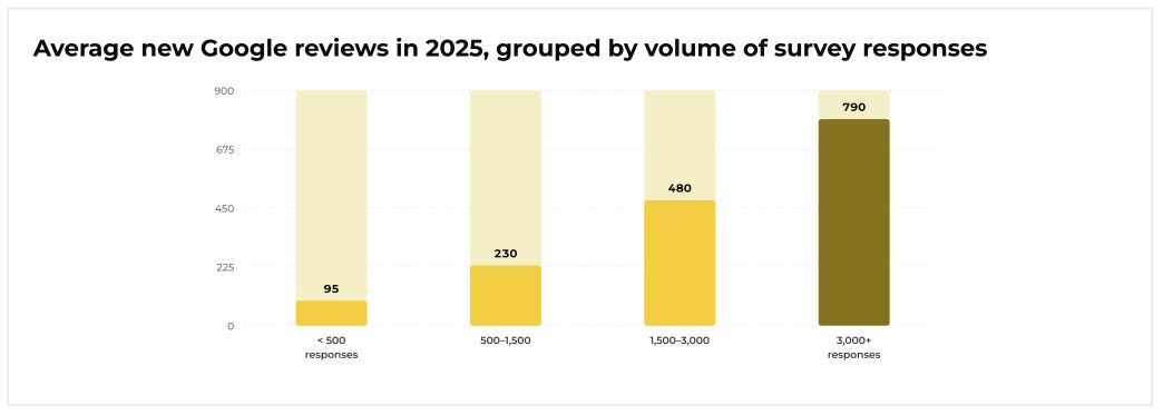
The mechanism is pretty straightforward: satisfied patients who've just finished a survey are also highly motivated to share their experience publicly. A patient feedback system, set up correctly, doubles as a reputation engine.
The through-line
Taken together, the five findings describe a loop rather than a list: private clinics start ahead, a healthy score hides real risk, that risk is about the programme rather than the patients, the programme is cheap to improve, and improving it pays off well beyond the survey.
The clinics pulling away aren't the ones with the best patients — they're the ones that treat feedback as a system, not a scoreboard.
How do we know these numbers are real?
Big, quotable numbers are easy to produce and easy to get wrong. Most of the work on this report went into not getting them wrong. Here are a few examples from behind the scenes:
We didn't pad the response rates. Some patients open a survey but never submit — often because they declined the privacy-consent question, which is a perfectly valid choice. Lumping "didn't answer" together with "chose not to consent" would have skewed both our response rates and our NPS. So we do record those visits, but we also don’t include them in the metrics.
A timezone bug nearly broke our send time recommendations. Our "best time of day to send a survey" analysis is only useful if the clock is right — and it very nearly wasn't. Timestamps across our markets were stored in local time but labelled as UTC, and different regions handle time zones and daylight saving differently. Left uncorrected, our send-time recommendations would have been off by one to two hours.
We refused to draw conclusions from tiny samples. A niche with 40 responses can produce a wild NPS that means nothing. So we carefully observed all our initial data, in every segment in the report, and its margin of error — depending on how many responses sit behind it. If a number isn't solid, we choose to say so or not use it at all.
We modelled response bias, not just observed it. Who answers a patient survey isn't a perfect mirror of who walked through the door. Rather than eyeball raw response rates, we ran a model that predicts how likely a patient is to respond while accounting for channel, country, speciality, time of day, and day of week all at once. That lets us flag the groups that systematically over- or under-respond even after everything else is controlled for — so we know exactly where the data leans.
We were extra careful when matching messy real-world records. Linking each clinic's NPS to its Google reviews meant matching locations across two entirely separate data sources, where the same clinic might appear under a slightly different name. Getting that normalisation right is unglamorous work, but it's the only reason the "feedback drives reviews" finding can be trusted.
None of this is the exciting part of the report. But it is the reason the exciting parts are worth trusting!
What's in the full report
The full 2025 Benchmark Report goes well beyond the highlights above. It answers questions like:
- How does my speciality's NPS compare to its direct peers — not to healthcare in general?
- Which survey message wording gets the most responses, and the best scores?
- What is the single highest-return change I can make to my feedback programme?
- How much of my patients' sentiment is negative, even when the scores look fine?
- How much public reputation is my feedback programme actually generating — and how do I benchmark it?
And much more.
👉 Download the full 2025 Benchmark Report


